What will I see here?
- Selectors level 4
- Filter Effects level 1
- Other cool stuff from the future
CSS4... wait, what?
- Cascading Style Sheets, Selectors level 4
- it's just a draft
- independent from CSS3
- can and will change
- quicker finishing of the CSS3 specs
- no implementations
- far future
Selectors lvl 4 - CSS4 draft in details
- Logical pseudo-classes (:matches, :not)
- Location pseudo-classes (:any-link, :local-link)
- Time-dimensional pseudo-classes (:past, :current, :future)
- UI states pseudo-class (:indeterminate)
- Tree-structural pseudo-classes (:nth-match, :nth-last-match)
- Grid-structural pseudo-classes (:column, :nth-column, :nth-last-column)
- ...and the Holy Grail - parent selector!
Logical pseudo-classes
Gather multiple definitions into one
li a:link, li a:hover, li a:visited, li a:focus
li a:matches(:link, :hover, :visited, :focus)
Mozilla's :-moz-any()
Known before, but now have super powers
p:not(.active, .visible)
Location pseudo-classes
Little helper for the links
a:link, a:visited => a:any-link
Useful for breadcrumbs, menus, external links
http://end3r.com/portfolio/client/gtech/
:local-link(0)
http://end3r.com/
:local-link(2)
http://end3r.com/portfolio/client/
Time-dimensional pseudo-classes
Selecting spoken words, karaoke style
text-to-speech, subtitles for the WebVTT
p:current { color: #333; border: 1px solid #999; }
UI states pseudo-class
Target default state and style it
checkbox, radio button
input.checkbox:indeterminate { background: #ccc; }
Tree-structural pseudo-classes
- :nth-match, :nth-last-match
Use matching on chosen elements
:nth-child() and :matches()
Cool: :nth-child(even)
Cool: :matches(.active)
Uber-cool: li a:nth-match(even of .active)
Grid-structural pseudo-classes
- :column, :nth-column, :nth-last-column
Selecting columns just like rows in the table
:column(.total)
:nth-column(even)
:nth-last-column(2n+1)
Parent selector
The force is strong in this one
Long-awaited multi-purpose swiss army knife
Easier styling of generated menus
ul li a.active
ul $li a.active
$body header a.styleSwitcher:hover { background: red; }
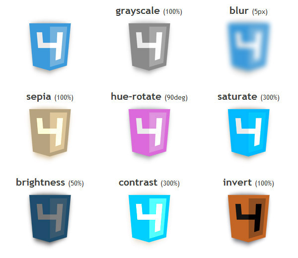
Filter Effects level 1
- grayscale
- blur
- sepia
- hue-rotate
- saturate
- brightness
- contrast
- invert
Grayscale
img { -webkit-filter: grayscale(100%); }


Blur
img { -webkit-filter: blur(5px); }

Sepia
img { -webkit-filter: sepia(100%); }

Hue-rotate
img { -webkit-filter: hue-rotate(90deg); }
Saturate
img { -webkit-filter: saturate(300%); }

Brightness
img { -webkit-filter: brightness(50%); }

Contrast
img { -webkit-filter: contrast(300%); }

Invert
img { -webkit-filter: invert(100%); }
Mac OS X users: Cmd + Alt + Ctrl + 8
All of the filter effects
Other cool stuff
- Shaders
- Values
- Variables
- Feature detection
- Mixins
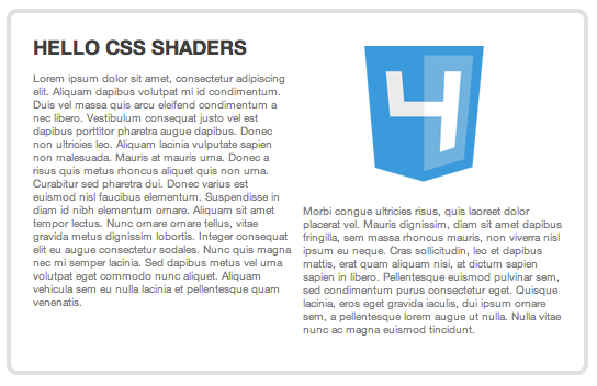
Shaders
3D GFX moving to WebGL
Vertex shaders, fragment shaders
.old-book-page { filter: custom(url('book.vs') url('old-page-paper.fs')); }
Values
calculate the CSS values
width: calc((12em * 3) + 10px);
height: min(3em, 30px);
font-size: calc(max(2em, 20px) - 4px);
Variables
write once, use everywhere
@var $textColor #FF0000;
h1 { color: $textColor; }
article { color: $textColor; }
Feature detection
Modernizr in the Stylesheet
@supports (display: grid) {}
@supports (background: linear-gradient) and (transform: rotate3d) {}
Mixins
repeating fragments
@mixin fragment { color: #F00; font-size: 14px; }
h1 { @mix fragment; margin: 10px; }
@mixin differentFragment($myColor #F00) { color: $myColor; font-size: 14px; }
h1 { @mix differentFragment(#00F); margin: 10px; }
Wrapping up
- shape the future
- take part in the development process
- suggest ideas
- create standards
- help others
- make tools that will be used by millions of web devs in the world